
Design Like a Pro: Easy Tips for Non-Designers
- seedofartdesign

- Oct 27, 2025
- 3 min read

Creating polished, professional-looking designs doesn’t have to mean hiring a graphic designer or learning complex software. With the right tools and a few design principles, you can elevate your work to look sleek, cohesive, and studio-quality — even from home.
Whether you’re designing a flyer, social media post, banner, or event sign, these tips (and a DIY editable template from SeedofArtDesign.com will help your project stand out like it was crafted by a pro.
1. Start with a Strong Foundation: Use a Grid or Layout System
Professional designers rely on structure. Using grids or alignment tools helps organize your layout, keeping everything balanced and easy to read.
📐 Pro tip:
Align text boxes, images, and shapes evenly. Most design platforms (like Canva, Corjl, or Adobe Express) include alignment guides—use them to keep your design crisp and clean.
2. Limit Your Fonts (and Choose Wisely)
A polished design rarely uses more than two fonts: one for headings and one for body text. The right font pairing instantly gives your design a professional look.
🖋️ Pro tip:
Pair a classic serif with a modern sans serif for contrast.
Keep font sizes consistent across similar elements.
Use decorative fonts sparingly—save them for headers or key phrases.
💡 Most Seed of Art Design templates already include curated font pairings, so you can skip the guesswork and jump right into personalization.
3. Stick to a Simple, Cohesive Color Palette
Designers use intentional color palettes that evoke emotion and fit the theme. Too many colors can make a design feel chaotic; a few well-chosen hues feel professional and harmonious.
🎨 Pro tip:
Choose 2–3 main colors plus neutrals.
Use tools like Coolors or Adobe Color for inspiration.
Keep text readable—always ensure strong contrast with the background.
✨ Curated templates from SeedofArtDesign.com are thoughtfully crafted with balanced, professional design elements—ready to make your project shine with ease and sophistication.
4. Use High-Quality Images and Elements
A single low-resolution image can ruin an otherwise great design. Always use high-quality, sharp images that align with your theme.
📸 Pro tip:
Use professional stock photos or mockups from trusted sources. And if you’re using a Seed of Art Design template, your base layout already includes premium-quality design elements—no pixelation, no guesswork.
5. Master White Space (a Designer’s Secret Weapon)
White space—empty space around your text and images—creates breathing room and balance. Don’t feel the need to fill every corner; simplicity adds elegance.
🤍 Pro tip:
Give each section space to stand on its own. A clutter-free design always feels more polished and intentional.
6. Use Visual Hierarchy to Guide the Eye
Design hierarchy helps direct your viewer’s attention in the right order. Your most important information (like a title or date) should always stand out first.
🔠 Pro tip:
Use larger fonts or bold colors for primary information.
Keep supporting details smaller and lighter.
Balance visual weight evenly throughout the page.
7. Keep Your Branding Consistent
Consistency builds recognition and professionalism. Use the same fonts, colors, and logo placement across all your designs.
✨ Pro tip:
Create a simple brand style guide for yourself. With Seed of Art Design templates, you can easily apply your brand colors and fonts to multiple pieces for a cohesive look.
8. Use DIY Templates from SeedofArtDesign.com
If design isn’t your full-time job (and even if it is), templates are a game-changer. Every Seed of Art Design template is created with professional composition, typography, and color harmony in mind — so you can achieve designer-level results in minutes.
🎨 Pro tip:
Customize templates with your text, logo, and images. Add personal touches, but keep the core design intact for a professional finish.
9. Preview Before You Publish or Print
Before sharing or printing your design, always preview it on different screens or in print mode—this is one of the most important steps! Colors, spacing, and layout can look slightly different once printed.
🖨️ Pro tip:
Zoom out and view your design as a whole. If it looks balanced and easy to read at a glance, you’ve nailed it!
✨ Final Thoughts
You don’t need years of design training to create something beautiful and professional. By following these simple principles — and starting with a DIY editable template from SeedofArtDesign.com
— you can design like a pro with confidence.
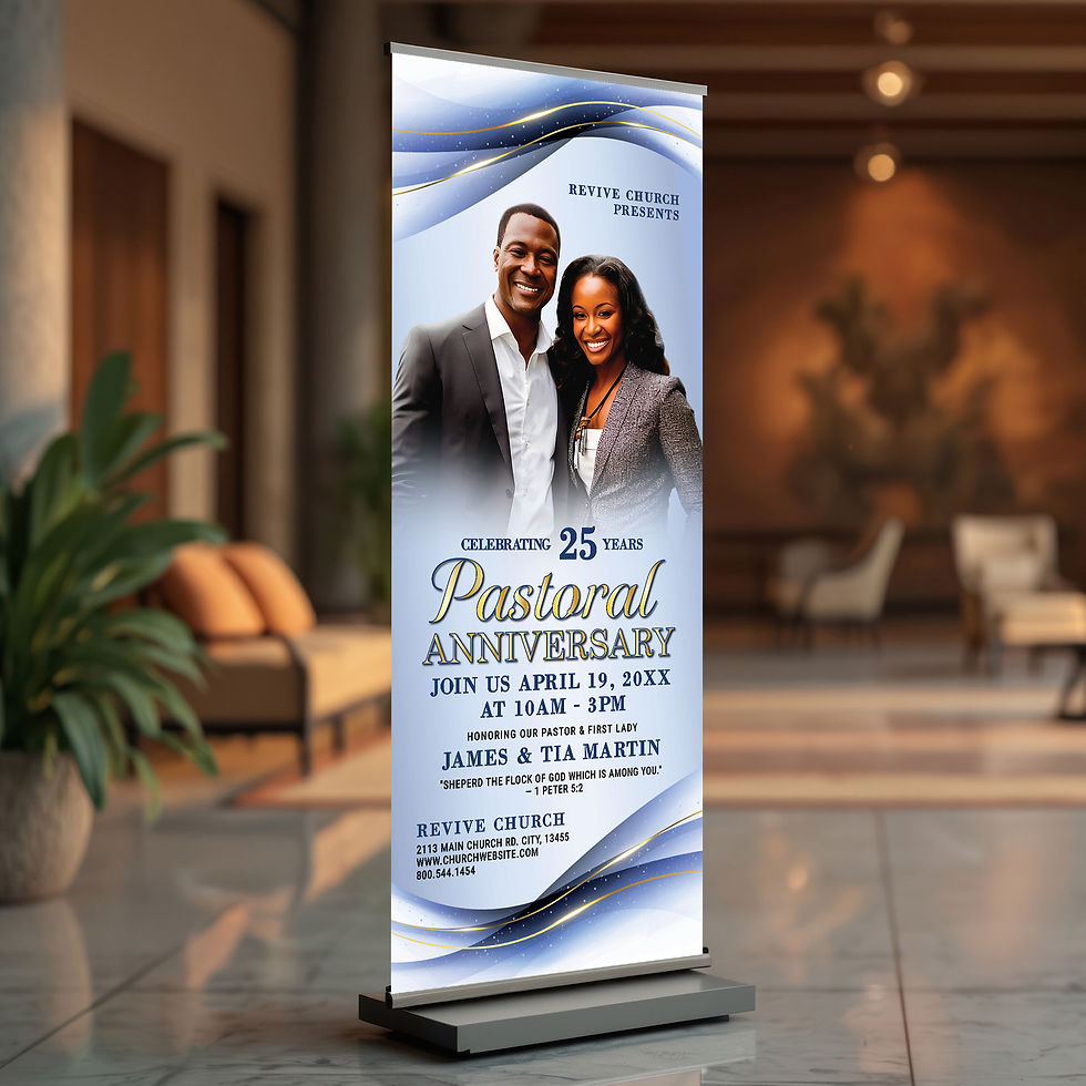
From church signs to business flyers to author events, our templates make it effortless to create polished, professional designs that stand out.
🌿 Ready to create like a designer?
Explore our collection of editable templates and elevate your next project with ease.
🛒 Shop now at SeedofArtDesign.com
Comments